Houselane24

Service

Logo Design, Website Development

Brand & Brief

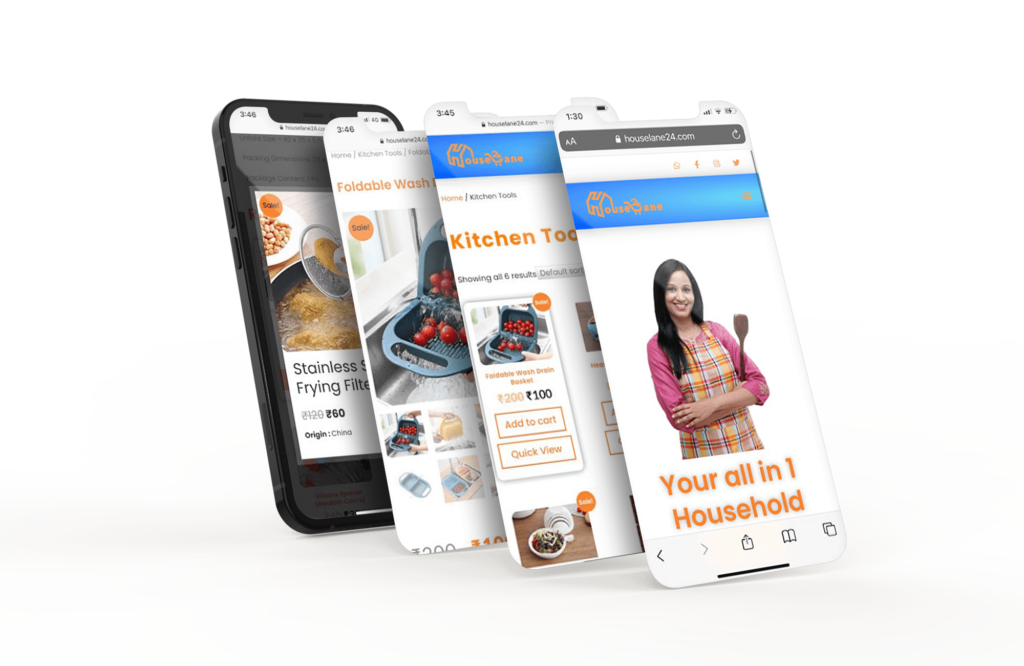
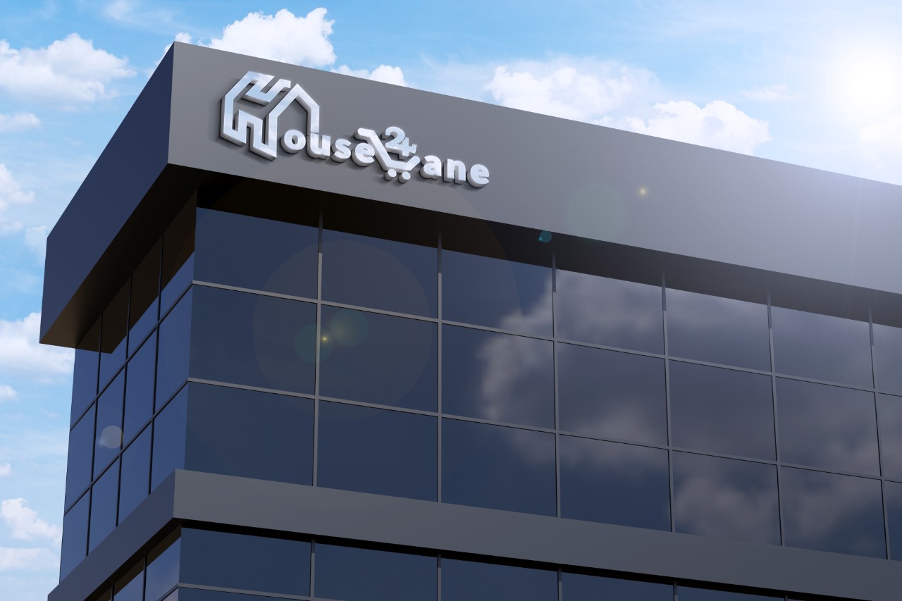
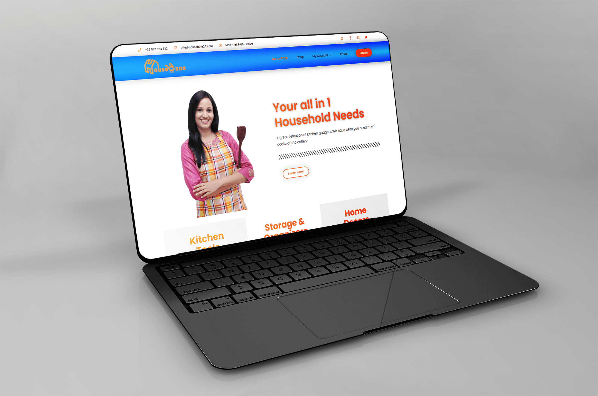
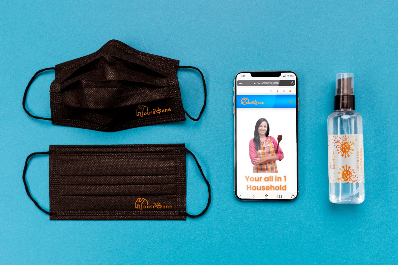
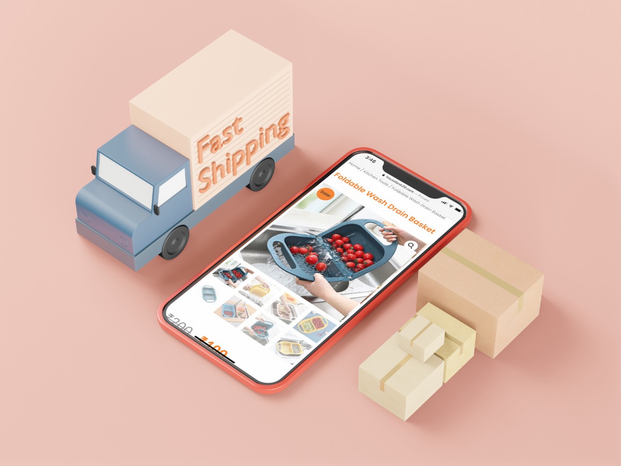
Houselane24 wanted to sell household and kitchen needs across PAN India. They contacted me to build their brand. To start with I have designed Logo and a user-centric eCommerce website. Here you can shop for inspiring home and kitchen needs & décor, in the comfort of your own home.

HouseLane24 - Mobile ecommerce

Objective

  • Build Brand Identity: Logo, E-commerce website
  • Improve overall site aesthetic and user experience in order to create a more engaging experience
  • Create a highly usable, searchable and browseable product catalogue with easy social sharing options and clear conversion points to contact for a quote
  • Develop a more SEO friendly and socially-focussed blog in order to drive user engagement and organic searches.
  • Introduce limited and custom eCommerce website options for specific products.
  • Implement a fully responsive solution backed by WordPress CMS and WooCommerce for cart functionality

HOUSELANE24

Logo
Design
Houselane24 Rectangle Logo

Logo is definitely the basic element for efficient branding and marketing. Its design, taken seriously and based on user research, analysis, talent and design laws can become a solid basis for successful communication of the brand with its buyers, customers and users, that is why it needs careful professional approach.

Traditionally the process started with handcrafted lettering versions in which special attention was paid to the initial capital letter H, L and 24 as it could potentially be further used for the application icon.
HouseLane24 Square Logo

The Approach

We developed a strategy to overhaul their website and online store to transform the purchasing journey. 

  • We improved the site’s easy purchasing for a seamless and enjoyable user experience
  • Automatic inventory sync meant that all stock levels would be aligned automatically, taking the hassle out of inventory and guaranteeing a positive customer experience 
  • Delivering consistent branding and appealing visual design throughout the site to elevate the brand as a whole and help the consumer understand the relationship between Brown Brothers and their additional brands
  • By implementing a multisite build we brought all of the sites under a single CMS for easier management

The Outcome.

HouseLane24 now has a sophisticated and modern website but it still focuses on its user friendliness. The website also represents the brand image and display the products they offer neatly. Chethan has tried to provide informative and compelling content for the audience, whilst the CTAs deliver conversions. The core of the website is making product searching and selecting faster and easier, so people can browse through the website comfortably and find the products that they want to have in their kitchen.

I am delighted to present to you the website of Houselane24.

Check out our work

Take a peek inside our Wonderworld

What Founder had to say?

I am text block. Click edit button to change this text. Lorem ipsum dolor sit amet, consectetur adipiscing elit. Ut elit tellus, luctus nec ullamcorper mattis, pulvinar dapibus leo. It is a long established fact that a reader will be distracted by the readable content of a page when looking at its layout.

Sukumar

Founder

Let's build your next digital product!

Copyright © 2020 | All Rights Reserved by Chethan Kumar A S